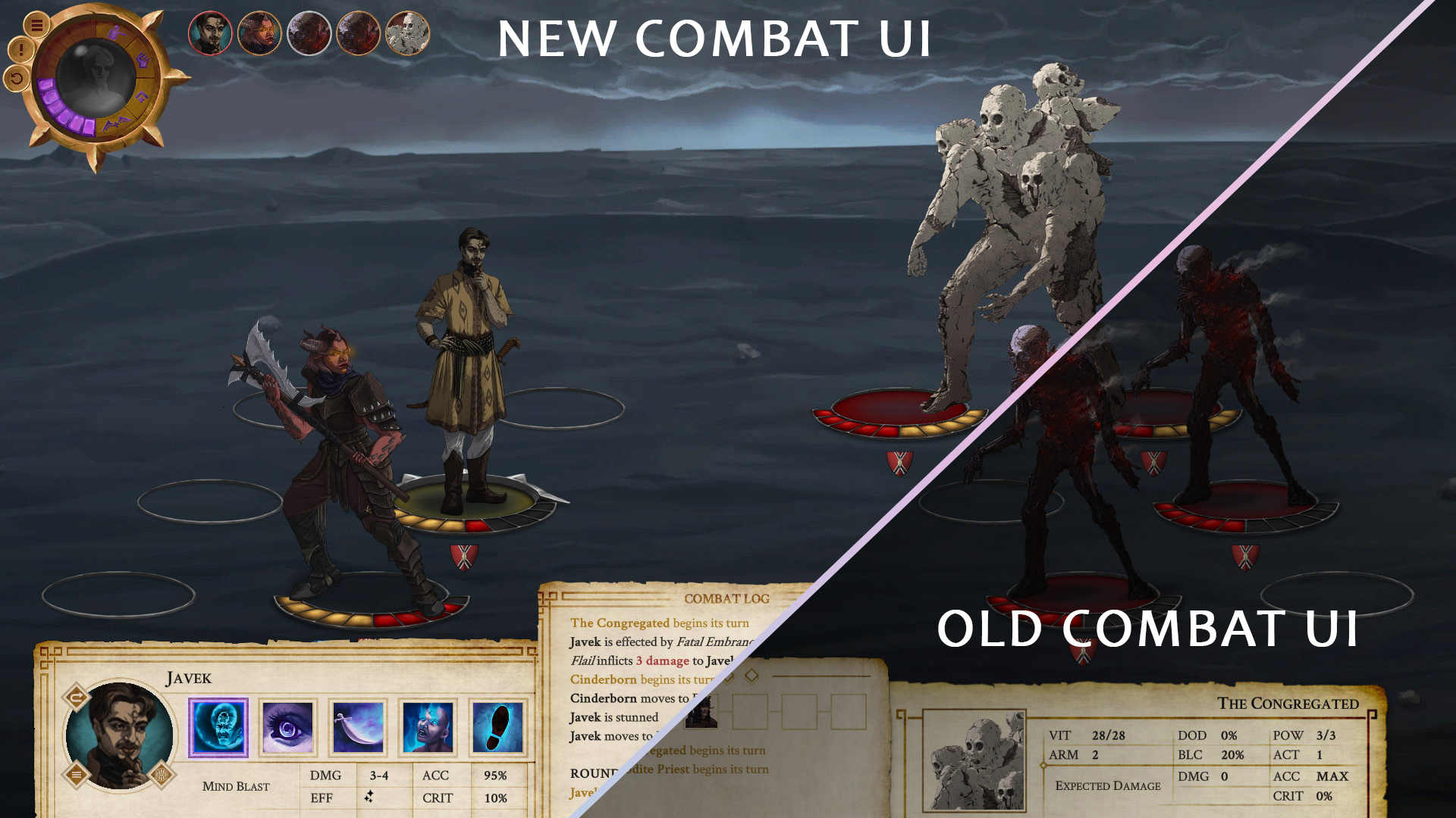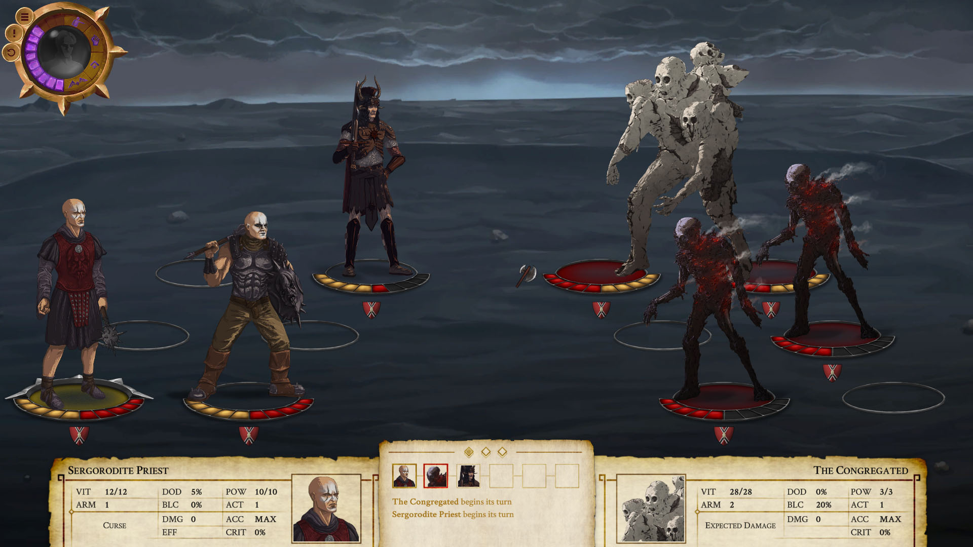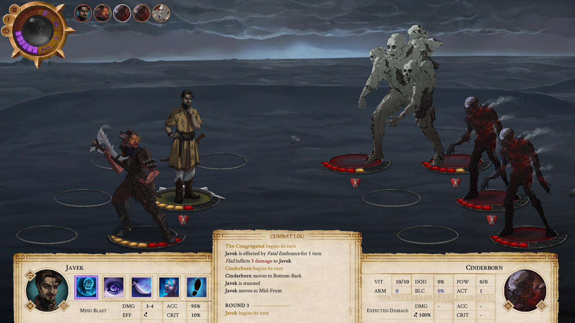
Hey everyone, let's talk combat. So based on the initial feedback and testing of the Companion combat, we have decided to revamp quite a lot of it. The process is still not fully complete, but you can already see the improvement on the images in the post.
Here's how the old design looked like:

...and the new:

The main changes are:
- Skill icons have replaced the previous skill selection (the little scroll). This does not only give better combat field visibility but also adds flavor to all the character skills.
- Skill confirmation also changed. It used to be a graphical representation on the combat field but now is a second click on the target itself or the skill itself (once the target is selected). It's a slicker solution that we are very satisfied with.
- Design changes that include simplified and more user friendly UI structures, tweaks to the position of the six combatants, and the initiative order. There are also a lot of little adjustments here and there, like the size and function of the combat log.
It's always great to see how far we've come with a part of the game and we hope you are as excited as we are.
Steam |
GoG |
Discord |
Patreon |
Youtube |
Twitter |
Facebook |
Instagram
